10 must-haves to include on your website homepage layout

When your ideal client lands on the homepage of your website, they want to know how you can help them.
They are looking to see if you are the best fit to solve THEIR problem. So your website needs to focus on them NOT you. To make a great first impression, you'll want to include these 10 must-haves to your website homepage layout.
Logo in the top left corner
Your ideal client scans your website homepage in a "Z" pattern. So top left to top right, then down to the bottom left, and then across to the bottom right. According to Nielsen Norman Group article, “Users are 89% more likely to remember logos shown in the traditional top-left position than logos placed on the right.” So make it the first thing they see because your logo is how they will identify your brand.
Navigation
Your main navigation should include links to your:
Homepage
About page
Service page, and
Contact page
If you use individual sales pages for your offers, link to each sales page instead of one main service page. If you use both a service page and a sales page, include a link to the service page AND a link to the sales page you are currently promoting. If there are pages that supplement your offers, then it's ok to include them too. For example, I have a link to my portfolio in my navigation. Because my ideal client wants to see my logo and website designs before deciding to work with me.
My only callout would be to make sure your navigation doesn't become too cluttered or overwhelming. The goal is for your ideal client to decide if you are the solution to their problem. So you want to make it super clear and easy for them to do so.
Large contact button in the top right corner
This button should lead your ideal client to the primary next step you want them to take. So it could be your contact form or even your main office's phone number. If you are launching a specific offer, then link the button to the offer's application.
Above the scroll
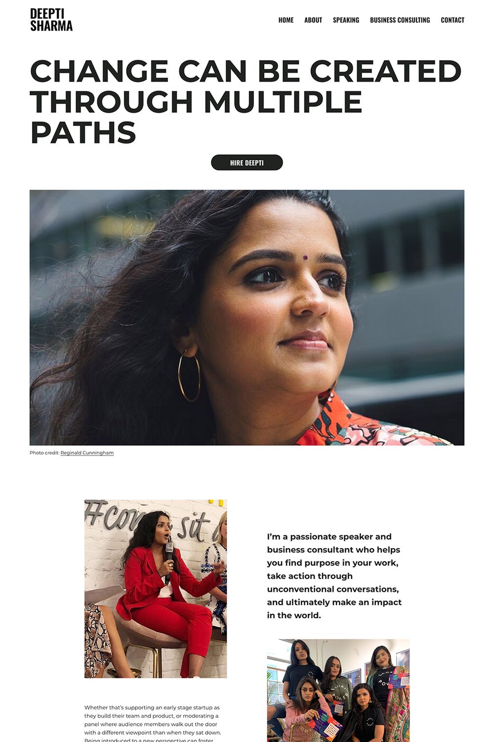
This is the main area on your website homepage layout that you see before you start scrolling. It's prime real estate and gives your ideal client a quick idea of how you can help them. It's called "above the scroll" because it pays tribute to newspaper design. "Above the Scroll" is the digital version of "Above the Fold". In newspaper design, the most important headlines are placed on the top half of a newspaper. So that they grab the reader's attention as they walk by since newspapers are folded in half when placed on newspaper stands.
Put your slogan or a CONCISE sentence explaining the transformation you help your clients achieve. Make sure to include a button linking to the primary next step you want your ideal client to take. A horizontal photo works best here.
Below the scroll
Once your potential client starts scrolling, the goal is to get your ideal client to think “Oh, she gets me!”. So the next section should debunk a myth they have about your industry. How does your brand address that common misconception? One paragraph would suffice. Then talk about the transformation your ideal client will walk away with after working with you. Include 3-5 bullet points of both the tangible and intangible results. Remember, your ideal client is always thinking “What’s in it for me?” So keep the focus on them. Choose a photo that complements what you are talking about. Also, include a button linking to the primary next step you want your ideal client to take.
Work with me section
List the top 3 ways potential clients can work with you. Include a title to the offer, 1-3 sentences describing the offer, and a button linking directly to it. You could use a photo or an icon to differentiate each offer. If you don't have 3 ways yet, one of the three ways could be to subscribe to your newsletter OR follow you on social media. So that they have an option to learn more about you before investing.
Blog or shop section (optional)
This section is optional depending on if you have a blog or a shop. If you do have a blog, feature the top 3 blog posts that your ideal client would find the most valuable. The ones that give them a quick win. If you have a shop, feature the top 3 best sellers.
About me section
Here's where you'll include a short intro paragraph about you. Succinctly talk about your why. It is NOT the place to give your life story. Remember, people don’t buy what you do. They buy why you do it. Simon Sinek does an amazing job explaining it in his TedX Talk (which by the way is my favorite). I also have this blog to help you find your why as an entrepreneur. Photo-wise, make sure to choose a photo where you are looking at the camera. It helps build trust with your ideal client. The button in this section should link to your About page.
Testimonial
Social proof is essential and a non-negotiable. Include 3 testimonials on your website homepage layout. No generic testimonials, please. You want to curate each of your testimonials. So that they talk about where they were before and how their lives have changed after working with you.
Subscribe to newsletter
To continue building a relationship with your ideal client, have them to join your email newsletter. This way you can stay top of mind. Include a short description of what kind of content they can expect if they subscribe. The key is to make it sound exclusive so they want to give you their email address. Make sure to get their email address and (at least) their first name so you can personalize your newsletter.
Footer
The footer of your website homepage layout should include:
Your logo to remind your potential client whose website they are on and to build recognition
Copyright info. It should read: ©[Year you created your website-current year] [Your business name]. All Rights Reserved.
Individual links to your offers, homepage, about page, service (if you use one), contact page
Your website compliance. This includes your privacy policy (required by law), cookie policy, terms and conditions, and any disclaimers. Disclaimers are mostly used by healthcare and mental health professionals, lawyers, and coaches.
Social media links. I would recommend using social media icons vs writing out the word (ie. using the Instagram logo vs a link saying “Instagram”). I’ve noticed users assume brands don’t have a social media presence when they can’t immediately find the social media logo.
Whenever I design a website homepage layout, I ensure I have all these pieces first. Then I flex my creative muscles and have fun with the design. Because design alone can only take your business so far. To make a connection with your ideal client, you need visuals to attract and copy to keep them there. So that you build trust with your potential clients and get them to say “Yes, I want to work with you!”
Check out how I applied these must-have to my clients’ website homepage layouts.